| Home |
| Path Ad |
| Logo |
| Flyer |
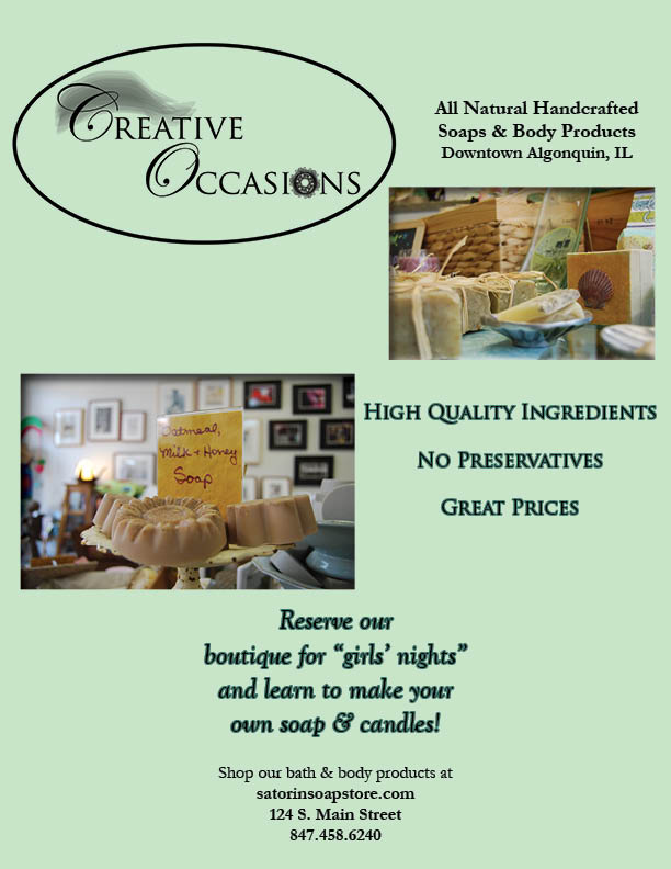
Message Strategy: This flyer was a design that I conceptualized using elements from Photoshop and Illustrator; I then placed the final design in InDesign. The central idea of my flyer's message was to convey the high quality of the soaps and candles sold at Creative Occasions, a small fair-trade business in Algonquin, IL. The audience for this flyer consisted of the demographic of teenage to elderly women within McHenry County, IL. This audience segment affected my message in a few ways; I concentrated on creating a curvy, feminine logo as well as made sure there was well-established balance throughout to give off the relaxing vibe that the store is known for. The flyer is a quality message because of the great attention to detail from the photo selection to the font type and size. Each photo appropriately displays the shop's products in a colorful, inviting way and the size of the font draws is large enough to draw viewers in so that they can then read the contact information at the bottom of the flyer.
Design Knowledge & Application: My knowledge of design learned in the class contributed greatly to the quality of this flyer. I thought about color psychology when conceptualizing this design as I utilized a cool blue-green to illustrate the peaceful vibe and atmosphere of Creative Occasions. I also made sure that I picked out an italicized typeface when referring to the girls' night to convey a soft, feminine feeling that the shop provides. Throughout the flyer, the text tapers to one point for each text block. This demonstrates that there is unity, similarity, and balance on the page. The repetition of the text in this tapered form makes the viewer comfortable with the design as a viewing audience is most likely bound to be more interested in a design that uses repetition and balance than one that does not.
Professional Message Skill: This flyer also displays qualities of a skillfully-created professional message. Giving the logo enough space so that it is isolated and creating a bold oval around the logo's words signifies that it is the most important point on the flyer. Thus, the logo is the focal point of the flyer. Visual hierarchy was also utilized throughout this piece. The most crucial information to pick out from the flyer was put into a larger font. Secondary information was then placed in a smaller font to signify that it was less important. Lastly, I used a serif font throughout the flyer to tell my audience that this is a well-established shop with high quality products. For these reasons, this flyer displays that I have the ability to execute a skillfully-created professional message.
