| Home |
| Path Ad |
| Logo |
| Flyer |
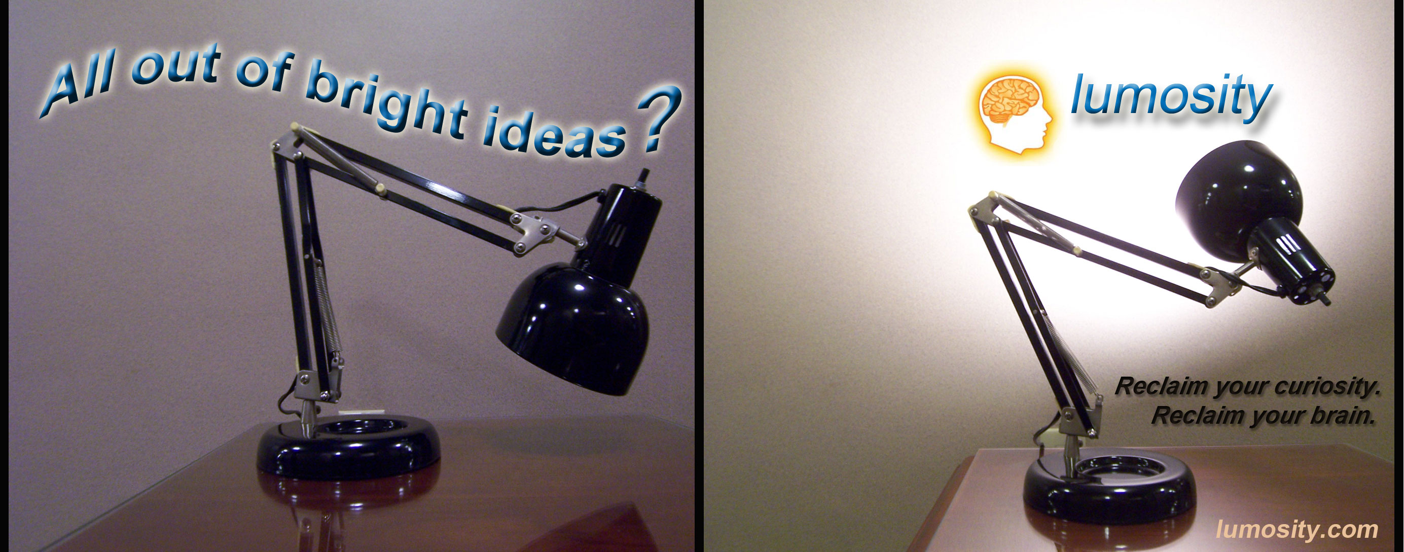
Message Strategy: This path advertisement was created using different elements in Photoshop. The central idea of this path ad is to demonstrate that positive cognitive qualities can be gained from lumosity.com, a site which provides exercises and games to stretch your brain. This message would, hypothetically, be placed on lumosity.com as well as other related and non-related sites to promote the various services the website offers. Therefore, my audience for this path ad would consist of a limitless number. I had to then make my advertisement eye-catching, creative, and easy to read as any Internet user could pass it by without taking the time to thoroughly examine it. This message is of good quality because of the clarity of the photos, logo, and text within the frame as well as how well the path flows within the storyboard fashion.
Design Knowledge & Application: This piece depicts my ability to retain knowledge within a design context and then apply that knowledge. One way in which I used my knowledge from the layout and design class was through connecting an idea with the text. To signify that I was talking about the word "bright," I highlighted the text behind the sentence containing the word. Another way that I used my knowledge of path ads was through creating a clear path to my main idea, lumosity.com. The secondary idea I wanted to share with my audience was "Reclaim your curiosity. Reclaim your brain." This was displayed through first leading the viewer to the logo, and then pulling the viewer's eyes to the text below the lamphead. Lastly, I created a personality for the lamp which made the lamp's line of sight visible and believable in the second photo.
Professional Message Skill: This path ad for lumosity.com acts as a great example of a professional message using skill. In my path ad, I made certain I highlighted "lumosity" in a bright, alluring manner to illustrate that the character of the lamp became brighter after "viewing" the site. By isolating the site's logo, I created a clear, crisp focal point. There is also a nice unity throughout the piece through the use of the storyboard effect. The viewer can see a beginning and an ending to the story, making the conflict resolved. I have also created a well-planned out visual hierarchy--the information I would like my audience to take away from the message is that, simply, lumosity is good for you. To achieve this goal, "lumosity" is lit up and is put in a large font.