| Home |
| Path Ad |
| Logo |
| Flyer |
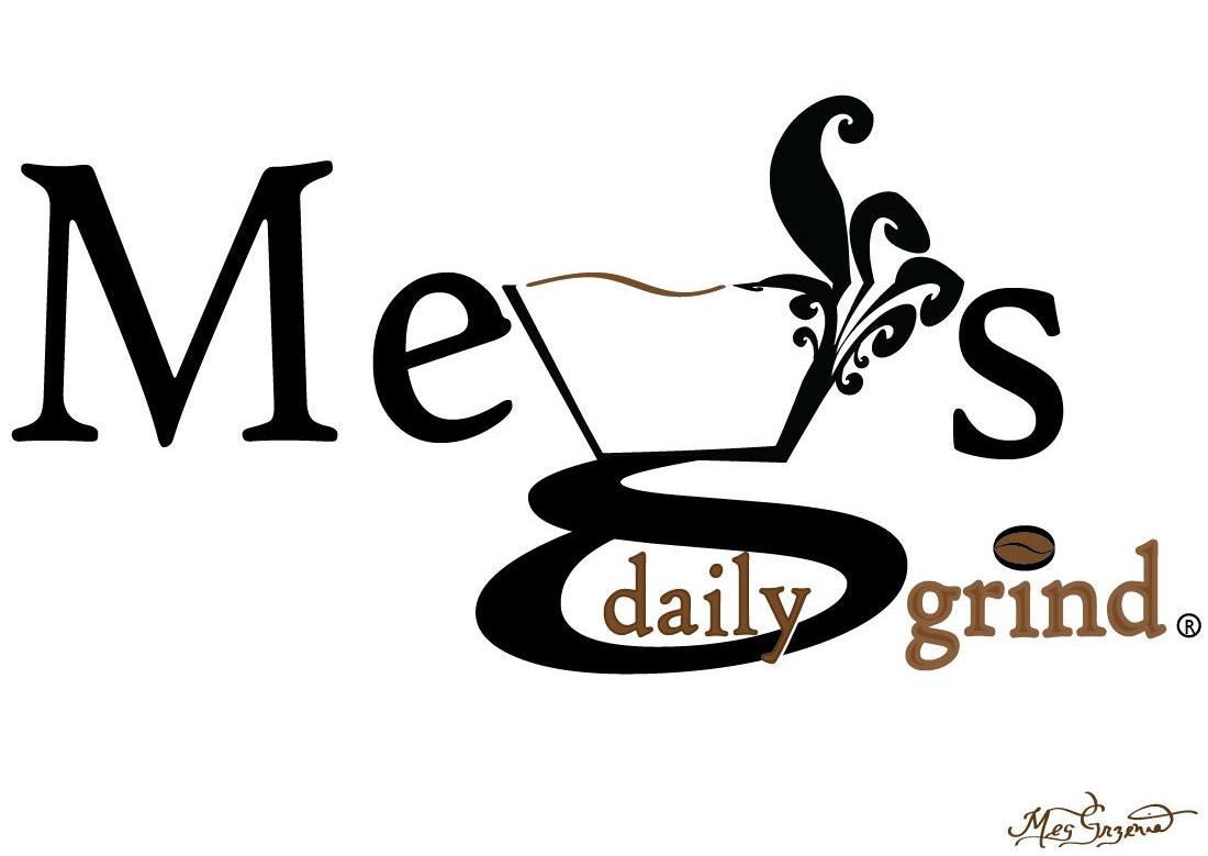
Message Strategy: This logo was designed using fonts and shapes within the Illustrator program. The main concept of my message for the logo is to share with my audience that the logo represents a welcoming coffee shop. My audience consists of coffee consumers in the Rockford metro area; this means young adults to an elderly population would be the age range for my audience. This audience affected the how the logo was created because I had to make sure that it appealed to a broad audience. The black and white motif is very popular among young people today and the large font is easy enough for anyone to read. My logo is an excellent example of a quality message because it demonstrates my eye for detail in two ways; first, it represents the upbeat, friendly staff working at Meg's Daily Grind as well as the shops inviting atmosphere through the flourish shooting from the side of the cup. The personality of the business is clearly seen through the logo, which makes it a good quality message. Secondly, this is an example of a design that has quality because of the effective layout and the manner in which the logo reads. This is a clear, straightforward message with a definite path from word to word. The simplicity of the message combined with the flourish, give the logo a solid foundation for viewers to read and identify with the vibe of the coffee shop.
Design Knowledge & Application: When creating my logo, it was crucial to keep in mind and utilize elements of design that were taught throughout the class period. For example, I used the two colors brown and black to convey two separate ideas. The black, as well as the serif font choice, used for "Meg's" gives my audience the feeling that the company is well-established. Black is a color which conveys importance and this hue combined with the serif font illustrate the stability of Meg's Daily Grind. The brown elements, on the other hand, tell my audience that this is a logo for a coffee shop. While the black flourish could be interpreted as either an apostrophe or steam coming from the cup (shaped from the "g"), the beauty of this concept is that it leaves the viewer guessing and inviting him to take a further look at the logo. The bean also produces another part of the face of the company. Because of these two pictorial concepts, I was able to show that the logo encapsulated the company without focusing on one aspect--a key ingredient to creating a logo.
Professional Message Skill: The Meg's Daily Grind logo is an excellent example of my professional message skill for three distinct reasons. Because of the sizing of the fonts used throughout the logo, there is a definite visual tempo within the logo. The tempo reads, "LARGE small small" (MEG'S daily grind). This then highlights the important part to take away from the logo. This logo also displays the properties required for ease of reproduction. There are only two different colors used, the design is clear and easy to read, and there are a variety of sizes and shapes used which make it easy to reproduce at any time. Lastly, the logo is easy to remember. There are only a few technical elements to the design in addition to little detail and simple marks which make the logo stick with the viewer.